
The art and science of exhibition graphics: Understanding colour psychology in exhibition design
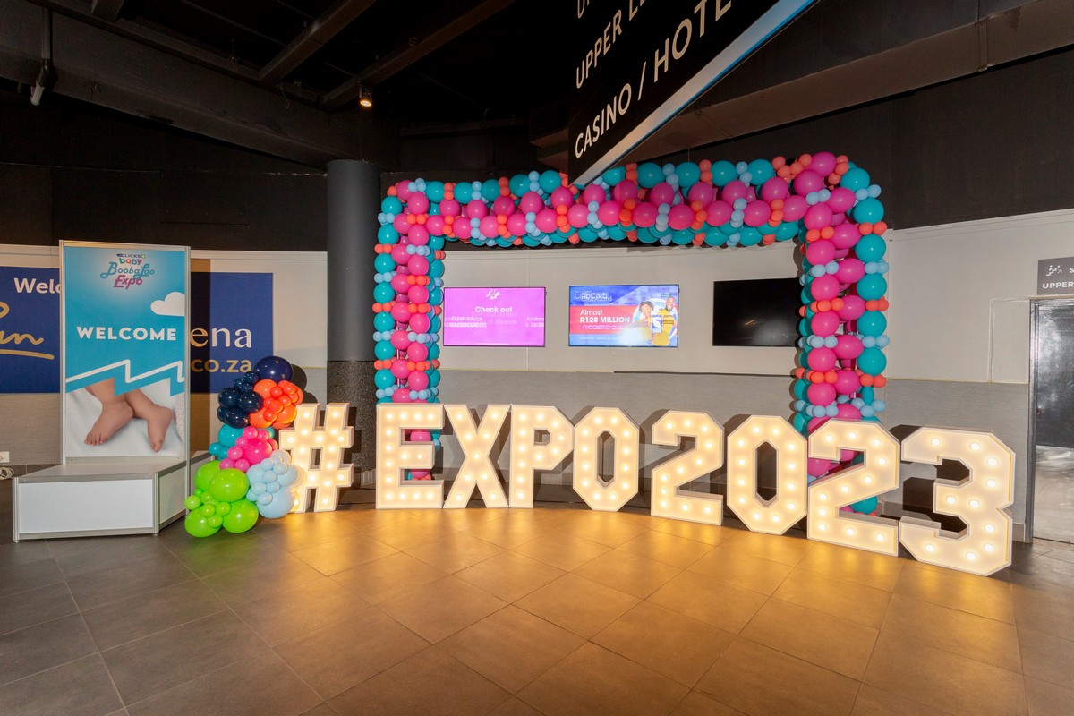
Audiences and leave a lasting impression, the role of exhibition graphics extends beyond mere aesthetics. Every colour choice in exhibition design holds the power to influence emotions, perceptions, and brand associations. This article delves into the fascinating realm of colour psychology in exhibition graphics, exploring how the strategic use of colour can shape attendee experiences, reinforce brand messaging, and elevate the overall impact of a booth on the exhibition floor.
The Psychology of Colour
Before exploring the specific applications of colour in exhibition design, it’s crucial to comprehend the psychological connotations that various colours typically carry.
- Red: Often associated with energy, passion, and urgency, red is a powerful and attention-grabbing colour. It can evoke excitement and stimulate the senses, making it suitable for brands aiming to convey boldness and dynamism.
- Blue: Representing trust, calmness, and professionalism, blue is a popular choice for brands seeking to establish a sense of reliability and competence. It can create a serene and inviting atmosphere, making attendees feel comfortable and confident in engaging with the brand.
- Green: Symbolising growth, nature, and health, green is frequently used to convey freshness and eco-friendliness. It is an excellent choice for brands emphasising sustainability or those in industries related to health and wellness.
- Yellow: Radiating warmth, positivity, and optimism, yellow is an attention-grabbing colour that can create a sense of enthusiasm. It is often used to draw attention to specific elements within a booth or to convey a vibrant and lively brand personality.
- Purple: Associated with luxury, sophistication, and creativity, purple conveys a sense of elegance and uniqueness. It is often chosen by brands looking to establish themselves as innovative or premium.
- Orange: Combining the energy of red and the warmth of yellow, orange exudes enthusiasm, creativity, and friendliness. It is a dynamic colour that can create a lively and approachable brand image.
- Neutral colours (grey, black, white): Neutral colours are versatile and can convey simplicity, sophistication, or modernity. They provide a balanced backdrop for other colours and are often used to create a clean and minimalist aesthetic.
Applications Of colour Psychology In Exhibition Graphics
- Brand consistency: The strategic use of brand colours in exhibition graphics ensures consistency with the overall brand identity. Consistency fosters brand recognition and reinforces the visual connection between the exhibition presence and other brand touchpoints.
- Creating a mood: Different colours evoke distinct emotional responses. By carefully selecting colours based on the desired mood or atmosphere, exhibitors can influence how attendees perceive their brand. For example, warm tones like red and orange may create an energetic and lively atmosphere, while cooler tones like blue and green can convey calmness and professionalism.
- Highlighting key messages: Colours can draw attention to specific messages or elements within the booth. Bright and contrasting colours can make important information or calls to action stand out, guiding attendees’ focus and encouraging interaction with key brand messages.
- Guiding attendee flow: The strategic use of colour can influence traffic flow within the booth. Bright and bold colours can serve as a way to find elements, guiding attendees through different sections or directing them toward specific products or experiences.
- Cultural considerations: Cultural associations with colours vary, and it’s essential to consider the cultural context of the target audience. Colours with positive connotations in one culture may have different meanings in another. A thoughtful approach to colour selection ensures the exhibition graphics resonate positively with diverse audiences.
- Branding in a crowded space: In the bustling environment of an exhibition, where numerous booths compete for attention, a suitable colour scheme can make a booth stand out. Vibrant and contrasting colours can help a booth grab attention, making it more memorable in attendees’ minds.
- Conveying brand personality: Colours play a crucial role in conveying brand personality. Whether a brand seeks to communicate boldness, reliability, innovation, or friendliness, the chosen colour palette should align with the intended brand personality.
Contact ExpoGuys For Details
In exhibition graphics, colour psychology is a potent tool for influencing emotions, perceptions, and brand associations. The strategic use of colour goes beyond aesthetics; it shapes attendee experiences, reinforces key messages, and contributes to the overall success of a brand’s exhibition presence.
Exhibitors who understand the psychological impact of colour can harness its power to create compelling and memorable brand experiences on the exhibition floor. Partner with ExpoGuys to ensure you work with the best designers to create standout exhibition graphics. Contact us today to discuss your needs for a seamless and successful experience.